2D Panels and Text
Twenty-four HUD panel recipes side by side, each one property away from the last: fill only, border only, transparent fill over a stripe that proves it, a fill colour of its own, rounded corners, heavy borders, glows of three strengths and colours, glass, a ship-console panel with corner ticks and a gauge, dashed rings and lines that turn and march, a gradient to the text colour, a gradient to nothing, a panel at a third opacity, a translucent border, an additive glow, a glow on a see-through panel, a hairline border, a twelve-sided badge, a forty-point dashed route, two see-through panels overlapping, and a concave bracket frame. Every panel appears twice - alone, and carrying world text that demonstrates height, font size, colour alpha, opacity, glow, alignment and system fonts in regular, bold, italic and monospace. Five themes switch live.
The Program.cs file shows how to:
- Panels with ShapeBatch - border, fill, glow, dashes, gradient and opacity as captured state
- A fill colour of its own versus a fill derived from the outline colour
- Showing transparency honestly by drawing a stripe behind every panel
- Dashes on rings and lines, animated by advancing the phase
- A fill gradient to a colour, and to alpha 0 for a glass fade
- One opacity over a whole panel
- Pixel-width lines and arcs as HUD ornaments that survive zooming
- An additive glow against a covering one, and a glow on a see-through panel
- A translucent border, a hairline border, and a polygon of any vertex count
- Strokes with DrawPixelPolyline - a dashed route and a concave, closed frame
- World text styling - Height, FontSize, TextColor alpha, Opacity, GlowColor and GlowSize
- Installed system fonts with SystemFonts, in four styles
- A live theme switch through a DebugOverlay dropdown
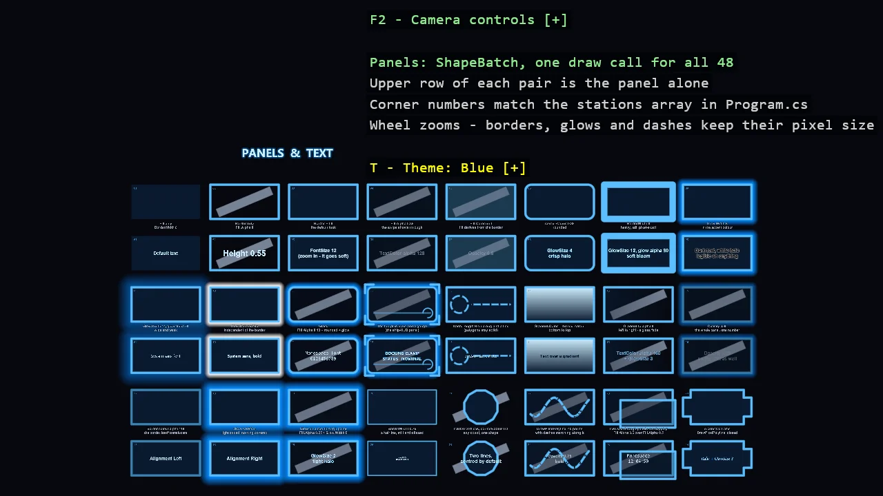
View on GitHub.
using Stride.CommunityToolkit.Engine;
using Stride.CommunityToolkit.Rendering.Text;
using Stride.CommunityToolkit.Scripts.Utilities;
using Stride.CommunityToolkit.Shapes;
using Stride.CommunityToolkit.Windows;
using Stride.Core.Mathematics;
using Stride.Engine;
using Stride.Games;
using Stride.Graphics;
using Stride.Graphics.Font;
using Stride.Input;

// A gallery of HUD panels and the text on them: twenty-four stations, each one property away from
// the last, so what every setting does is a matter of looking rather than reading.
//
// Two libraries meet here and it is worth knowing which is which. The PANELS are ShapeBatch - one
// instanced draw call for all of them, outlines that stay the same number of pixels wide however far
// you zoom, and border, fill, glow, dashes, gradient and opacity as batch state captured per draw.
// The TEXT is WorldTextComponent - entities in the scene, drawn by one renderer, with their own
// colour, opacity, glow and font.
//
// Each station appears twice: the panel alone, and the same panel with text on it. A light stripe
// runs behind every cell, because a see-through panel over a flat background just looks darker.
//
// T opens the theme list; 1-5 pick one. The mouse wheel zooms and the right button pans - zoom in on
// any station to see how little the borders, glows and dashes care about it.

const int Columns = 8;
const int Rows = 6;
const float ColumnPitch = 4.6f;
const float RowPitch = 3.0f;
const float PanelWidth = 4.0f;
const float PanelHeight = 2.0f;
const float ViewHeight = 29f;

// The grid sits low on purpose. The overlay is screen-space and lives in the top-right corner, so the
// band above the grid is what keeps it from covering the last columns.
const float GridOffsetY = -4.8f;

// The whole grid framed at once; every cell is one wheel notch away from filling the window
var panelSize = new Vector2(PanelWidth, PanelHeight);

// The stripe behind each cell, slanted so it is obvious it belongs to the background
var stripeAxisX = Vector3.Normalize(new Vector3(1f, 0.42f, 0f));
var stripeAxisY = Vector3.Normalize(new Vector3(-0.42f, 1f, 0f));

ShapeBatch? shapes = null;
SpriteFont? sansFont = null;
SpriteFont? boldFont = null;
SpriteFont? italicFont = null;
SpriteFont? monoFont = null;

var themeIndex = 0;
var time = 0f;
List<(WorldTextComponent Text, Action<WorldTextComponent, Theme> Restyle)> themedText = [];
DebugTextDropdown? themeMenu = null;

// The panel under the mouse, as the batch last drew it: every panel is drawn with its station as
// the tag, and the batch answers from the frame on screen
GalleryStation? hoveredPanel = null;

// Dark grounds throughout: a glow is light added to what is behind it, so it only reads as a glow
// against something dark. That is why every HUD in every spaceship is dark.
Theme[] themes =
[
    new("Blue", new Color(90, 190, 255), new Color(10, 26, 48), new Color(205, 238, 255), new Color(0, 140, 255)),
    new("Red", new Color(255, 95, 90), new Color(38, 12, 14), new Color(255, 210, 205), new Color(255, 40, 40)),
    new("Green", new Color(80, 245, 150), new Color(8, 34, 22), new Color(200, 255, 225), new Color(0, 220, 120)),
    new("Purple", new Color(185, 130, 255), new Color(26, 14, 46), new Color(230, 210, 255), new Color(150, 60, 255)),
    new("Orange", new Color(255, 170, 70), new Color(42, 22, 6), new Color(255, 228, 190), new Color(255, 130, 0)),
];

// One entry per station: how the panel is painted, and how the text on the copy below it is styled.
// Panel settings are ShapeBatch state; text settings are WorldTextComponent properties.
GalleryStation[] stations =
[
    new(1, "Fill only\nBorderWidth 0", "Default text",
        (text, theme) => text.TextColor = theme.Text,
        BorderWidth: 0f),

    new(2, "Border only\nFill.Alpha 0", "Height 0.55",
        (text, theme) => { text.TextColor = theme.Text; text.Height = 0.55f; },
        FillAlpha: 0f),

    new(3, "Border + fill\nthe default look", "FontSize 12\n(zoom in - it goes soft)",
        (text, theme) => { text.TextColor = theme.Text; text.FontSize = 12f; }),

    new(4, "Fill.Alpha 0.35\nthe stripe shows through", "TextColor alpha 128",
        (text, theme) => text.TextColor = new Color(theme.Text.R, theme.Text.G, theme.Text.B, (byte)128),
        FillAlpha: 0.35f),

    new(5, "Fill.Color null\nfill derives from the border", "Opacity 0.5",
        (text, theme) => { text.TextColor = theme.Text; text.Opacity = 0.5f; },
        DerivedFill: true, FillAlpha: 0.45f),

    new(6, "cornerRadius 0.35\nrounded", "GlowSize 4\ncrisp halo",
        (text, theme) => { text.TextColor = theme.Text; text.GlowColor = theme.Glow; text.GlowSize = 4f; },
        CornerRadius: 0.35f),

    new(7, "BorderWidth 6\nheavy, still pixel-exact", "GlowSize 12, glow alpha 90\nsoft bloom",
        (text, theme) => { text.TextColor = theme.Text; text.GlowColor = new Color(theme.Glow.R, theme.Glow.G, theme.Glow.B, (byte)90); text.GlowSize = 12f; },
        BorderWidth: 6f),

    new(8, "Glow.Width 6\nin the accent colour", "Dark text, white halo\nlegible on anything",
        (text, _) => { text.TextColor = new Color(10, 12, 18); text.GlowColor = Color.White; text.GlowSize = 7f; },
        GlowWidth: 6f),

    new(9, "Glow.Width 14, glow alpha 70\nwide and weak", "System sans font",
        (text, theme) => { text.TextColor = theme.Text; text.Font = sansFont; },
        GlowWidth: 14f, GlowAlpha: 70),

    new(10, "Glow.Color white\nindependent of the border", "System sans, bold",
        (text, theme) => { text.TextColor = theme.Text; text.Font = boldFont; },
        GlowWidth: 5f, WhiteGlow: true),

    new(11, "Glass\nFill.Alpha 0.18 + rounded + glow", "Monospace font\n0123456789",
        (text, theme) => { text.TextColor = theme.Text; text.Font = monoFont; },
        FillAlpha: 0.18f, CornerRadius: 0.3f, GlowWidth: 5f),

    new(12, "The lot, plus ticks and a gauge\n(the ship-HUD panel)", "DOCKING CLAMP\nSTATUS   NOMINAL",
        (text, theme) => { text.TextColor = theme.Text; text.Font = boldFont; text.GlowColor = theme.Glow; text.GlowSize = 5f; },
        BorderWidth: 1.5f, FillAlpha: 0.55f, CornerRadius: 0.25f, GlowWidth: 6f, Ornaments: true),

    new(13, "Dash.Length 6 on a ring and a line\n(polygons stay solid)", "System sans, italic",
        (text, theme) => { text.TextColor = theme.Text; text.Font = italicFont; },
        Dashed: true),

    new(14, "Gradient.Color = the text colour\nbottom to top", "Text over a gradient",
        (text, theme) => { text.TextColor = theme.Fill; text.Font = boldFont; },
        GradientTo: GradientTarget.Text),

    new(15, "Gradient to alpha 0\nleft to right - a glass fade", "TextColor alpha 160\n+ GlowSize 3",
        (text, theme) => { text.TextColor = new Color(theme.Text.R, theme.Text.G, theme.Text.B, (byte)160); text.GlowColor = theme.Glow; text.GlowSize = 3f; },
        FillAlpha: 0.6f, GradientTo: GradientTarget.Transparent),

    new(16, "Opacity 0.35\nthe whole panel, one number", "Opacity 0.35\non the text as well",
        (text, theme) => { text.TextColor = theme.Text; text.Opacity = 0.35f; },
        GlowWidth: 5f, Opacity: 0.35f),

    // The third row: what arrived with the premultiplied, linear-light renderer

    new(17, "Border colour alpha 110\nthe border itself translucent", "Alignment Left",
        (text, theme) => { text.TextColor = theme.Text; text.Alignment = TextAlignment.Left; },
        BorderAlpha: 110),

    new(18, "Glow.Additive\nlight added, nothing covered", "Alignment Right",
        (text, theme) => { text.TextColor = theme.Text; text.Alignment = TextAlignment.Right; },
        GlowWidth: 10f, AdditiveGlow: true),

    new(19, "Glow on a see-through panel\nFill.Alpha 0.25 + Glow.Width 8", "GlowSize 2\ntight halo",
        (text, theme) => { text.TextColor = theme.Text; text.GlowColor = theme.Glow; text.GlowSize = 2f; },
        FillAlpha: 0.25f, GlowWidth: 8f),

    new(20, "BorderWidth 0.75\na hairline, still anti-aliased", "Height 0.22\nsmall and sharp",
        (text, theme) => { text.TextColor = theme.Text; text.Height = 0.22f; },
        BorderWidth: 0.75f),

    new(21, "Twelve vertices, cornerRadius 0.1\nany count, one shape", "Two lines,\ncentred by default",
        (text, theme) => text.TextColor = theme.Text,
        Sides: 12, CornerRadius: 0.1f),

    new(22, "DrawPixelPolyline, 40 points\nwith dashes marching along it", "Opacity 0.75\nbold",
        (text, theme) => { text.TextColor = theme.Text; text.Font = boldFont; text.Opacity = 0.75f; },
        FillAlpha: 0.6f, Route: true),

    new(23, "Two see-through panels overlapping\nFill.Alpha 0.5 over Fill.Alpha 0.5", "Monospace\n12:04:59",
        (text, theme) => { text.TextColor = theme.Text; text.Font = monoFont; },
        FillAlpha: 0.5f, Overlap: true),

    new(24, "A concave frame\nDrawPixelPolyline, closed", "Italic + GlowSize 3",
        (text, theme) => { text.TextColor = theme.Text; text.Font = italicFont; text.GlowColor = theme.Glow; text.GlowSize = 3f; },
        Bracket: true),
];

// Per-monitor DPI awareness has to be enabled before the window exists, otherwise Windows
// hands us a stretched, blurry window on high-DPI displays.
WindowsDpiManager.EnablePerMonitorV2();

using var game = new Game();

game.Run(start: Start, update: Update);

void Start(Scene scene)
{
    game.Window.AllowUserResizing = true;

    // No ground and no physics: this is a gallery, and the default 2D ground would cut through it
    game.SetupBase2D(new Color(6, 8, 14));
    game.Add2DCameraController();
    game.AddWorldTextRenderer();

    shapes = game.AddShapeBatch();

    var camera = game.GetCameraEntity().Get<CameraComponent>();

    // The controller reads this on its first frame and returns to it when H resets the camera
    camera.OrthographicSize = ViewHeight;

    // A code-only game has no font assets, so any font other than Stride's default one comes from
    // the machine. Asking for a list rather than a name is what keeps this working off Windows;
    // game.LoadSystemFont("Segoe UI", 48) is the one-family version.
    sansFont = SystemFonts.LoadFirst(game.Services, SystemFonts.SansSerifCandidates, 48);
    boldFont = SystemFonts.LoadFirst(game.Services, SystemFonts.SansSerifCandidates, 48, FontStyle.Bold);
    italicFont = SystemFonts.LoadFirst(game.Services, SystemFonts.SansSerifCandidates, 48, FontStyle.Italic);
    monoFont = SystemFonts.LoadFirst(game.Services, SystemFonts.MonospaceCandidates, 48);

    // Fills the band the overlay does not reach, and is itself a station: a big glowing title is
    // exactly what the text component is for
    AddText(scene, new Vector3(-9f, 5.6f, 0f), "PANELS  &  TEXT", 0.9f,
        (text, theme) =>
        {
            text.TextColor = theme.Text;
            text.GlowColor = theme.Glow;
            text.GlowSize = 6f;
            text.Font = boldFont;
        });

    for (var i = 0; i < stations.Length; i++)
    {
        var station = stations[i];
        var panelCenter = CellCenter(i, withText: false);

        // Under the panel-only copy, in a neutral grey that belongs to no theme, so it reads as a
        // caption rather than as part of the panel
        AddText(scene, panelCenter - new Vector3(0f, PanelHeight / 2f + 0.38f, 0f), station.Caption, 0.23f,
            (text, _) =>
            {
                text.TextColor = new Color(150, 160, 175);

                // The halo is not decoration here: a caption sits over whatever glow the panel above
                // it throws, and a tight dark outline is what keeps grey text readable on both
                text.GlowColor = new Color(0, 0, 0, 200);
                text.GlowSize = 3f;
            },
            themed: false);

        // On the copy below it, the text names the setting that styles it - the station is its own label
        AddText(scene, CellCenter(i, withText: true), station.Label, 0.32f, station.StyleText);

        // The station's number in the top-left corner of both copies, so a panel on screen and its
        // entry in the stations array above can be matched at a glance
        foreach (var withText in new[] { false, true })
        {
            var corner = CellCenter(i, withText) + new Vector3(-PanelWidth / 2f + 0.14f, PanelHeight / 2f - 0.1f, 0f);

            AddText(scene, corner, $"{station.Number:00}", 0.2f,
                (text, theme) => text.TextColor = WithAlpha(theme.Accent, 170),
                anchor: TextAnchor.TopLeft, font: monoFont);
        }
    }

    themeMenu = new DebugTextDropdown
    {
        Title = "Theme",
        ToggleKey = Keys.T,
        TitleColor = Color.Yellow,
        SelectedIndex = themeIndex,
        CloseOnSelect = false,
        Items = [.. themes.Index().Select(pair => new DebugTextDropdownItem(
            (Keys)(Keys.D1 + pair.Index), pair.Item.Name, () => ApplyTheme(pair.Index)))],
    };

    var overlay = DebugOverlay.GetOrCreate(game);
    overlay.SectionGap = 0;
    overlay.AddSection("Panels", OverlayLines);
}

void Update(Scene scene, GameTime gameTime)
{
    if (shapes is null) return;

    themeMenu?.Update(game.Input);

    hoveredPanel = shapes.TryPick(game.Input.MousePosition, out var hit) ? hit.Tag as GalleryStation : null;

    time += (float)gameTime.Elapsed.TotalSeconds;

    var theme = themes[themeIndex];

    // Immediate mode: every panel is submitted again each frame, which is why a theme change needs
    // nothing more than reading the new colours here. All of them go out in one draw call.
    for (var i = 0; i < stations.Length; i++)
    {
        DrawPanel(stations[i], CellCenter(i, withText: false), theme);
        DrawPanel(stations[i], CellCenter(i, withText: true), theme);
    }
}

/// <summary>Paints one panel: the stripe behind it, the panel itself, and any ornaments.</summary>
void DrawPanel(GalleryStation station, Vector3 center, Theme theme)
{
    // The stripe is what makes transparency visible. Drawn first: shapes blend in submission order
    // and never write depth, so within a batch "behind" simply means "earlier".
    Reset();

    // Kept just inside the panel, slant included, so it never pokes out of a cell and gets mistaken
    // for part of the panel
    shapes!.DrawRectangle(center, stripeAxisX, stripeAxisY, new Vector2(PanelWidth * 0.85f, 0.5f), new Color(118, 130, 150));

    // Tagged with its station, so a pick hands the station back; the one under the mouse gets a
    // heavier border
    shapes.Tag = station;
    shapes.BorderWidth = station == hoveredPanel ? station.BorderWidth + 1.5f : station.BorderWidth;

    // null fills with the outline colour, which is the Box2D testbed's behaviour; a colour of its own
    // is what makes a dark panel behind a bright border
    shapes.Fill.Set(station.DerivedFill ? null : theme.Fill, station.FillAlpha);

    shapes.Glow.Set(station.GlowWidth, station.GlowWidth <= 0f ? null : WithAlpha(station.WhiteGlow ? Color.White : theme.Glow, station.GlowAlpha));

    // Additive: the glow adds its light to whatever is behind it instead of covering it - a neon
    // over a dark ground. Over a light one it would only saturate.
    shapes.Glow.Additive = station.AdditiveGlow;

    // The outline colour's own alpha applies to the border, so a border can be see-through too
    var accent = WithAlpha(theme.Accent, station.BorderAlpha);

    // A gradient runs from the fill to this colour across the panel; alpha 0 fades the fill out
    switch (station.GradientTo)
    {
        case GradientTarget.Text:
            shapes.Gradient.Set(theme.Text, Vector2.UnitY);
            break;
        case GradientTarget.Transparent:
            shapes.Gradient.Set(WithAlpha(theme.Fill, 0), Vector2.UnitX);
            break;
    }

    // One number over everything the panel draws - border, fill and glow together
    shapes.Opacity = station.Opacity;

    if (station.Sides > 0)
    {
        // A regular polygon of any vertex count is one shape, the same as a rectangle
        DrawPolygon(center, station.Sides, PanelHeight / 2f, accent, station.CornerRadius);
    }
    else if (station.Bracket)
    {
        DrawBracket(center, accent);
    }
    else
    {
        shapes.DrawRectangle(center, Vector3.UnitX, Vector3.UnitY, panelSize, accent, station.CornerRadius);
    }

    if (station.Overlap)
    {
        // The same panel again, offset: two translucent fills over each other, and the border of
        // the one on top over the fill of the one below, all composited in one pass
        shapes.DrawRectangle(center + new Vector3(0.55f, -0.4f, 0f), Vector3.UnitX, Vector3.UnitY, panelSize * 0.8f, accent, station.CornerRadius);
    }

    if (station.Ornaments)
    {
        DrawOrnaments(center, theme);
    }

    if (station.Dashed)
    {
        DrawDashes(center, theme);
    }

    if (station.Route)
    {
        DrawRoute(center, theme);
    }

    Reset();
}

/// <summary>A regular polygon standing on a flat bottom edge, filled and outlined like a panel.</summary>
void DrawPolygon(Vector3 center, int sides, float radius, Color color, float cornerRadius)
{
    Span<Vector2> vertices = stackalloc Vector2[sides];

    // Counter-clockwise, starting so that one edge lies flat at the bottom
    var start = -MathF.PI / 2f - MathF.PI / sides;

    for (var i = 0; i < sides; i++)
    {
        var (sin, cos) = MathF.SinCos(start + i * MathF.Tau / sides);

        vertices[i] = new Vector2(cos, sin) * (radius - cornerRadius);
    }

    shapes!.DrawSolidPolygon(vertices, new Vector2(center.X, center.Y), 0f, color, cornerRadius);
}

/// <summary>
/// A panel whose outline is a closed stroke with notched corners - concave, which no polygon fill
/// could be - over a fill built from two convex rectangles underneath, a cross whose union is
/// exactly the inside of the frame. Opaque, so the overlap of the two does not show.
/// </summary>
void DrawBracket(Vector3 center, Color color)
{
    const float Notch = 0.45f;

    var half = new Vector2(PanelWidth / 2f, PanelHeight / 2f);
    var c = new Vector2(center.X, center.Y);

    // The fill, borderless, a touch inside the stroke
    var borderWidth = shapes!.BorderWidth;

    shapes.BorderWidth = 0f;
    shapes.DrawRectangle(center, Vector3.UnitX, Vector3.UnitY, panelSize - new Vector2(0.12f, 2f * Notch + 0.12f), color);
    shapes.DrawRectangle(center, Vector3.UnitX, Vector3.UnitY, panelSize - new Vector2(2f * Notch + 0.12f, 0.12f), color);
    shapes.BorderWidth = borderWidth;

    // Twelve points: each corner is cut into two, turning inward
    ReadOnlySpan<Vector2> outline =
    [
        c + new Vector2(-half.X + Notch, -half.Y),
        c + new Vector2(half.X - Notch, -half.Y),
        c + new Vector2(half.X - Notch, -half.Y + Notch),
        c + new Vector2(half.X, -half.Y + Notch),
        c + new Vector2(half.X, half.Y - Notch),
        c + new Vector2(half.X - Notch, half.Y - Notch),
        c + new Vector2(half.X - Notch, half.Y),
        c + new Vector2(-half.X + Notch, half.Y),
        c + new Vector2(-half.X + Notch, half.Y - Notch),
        c + new Vector2(-half.X, half.Y - Notch),
        c + new Vector2(-half.X, -half.Y + Notch),
        c + new Vector2(-half.X + Notch, -half.Y + Notch),
    ];

    shapes.DrawPixelPolyline(outline, borderWidth, color, closed: true);
}

/// <summary>
/// A plotted route across the panel: forty points as one pixel-wide stroke with round joins, and a
/// dash pattern that runs along the whole of it.
/// </summary>
void DrawRoute(Vector3 center, Theme theme)
{
    Span<Vector2> route = stackalloc Vector2[40];

    for (var i = 0; i < route.Length; i++)
    {
        var t = i / (route.Length - 1f);
        var x = center.X - PanelWidth / 2f + 0.3f + t * (PanelWidth - 0.6f);
        var y = center.Y + MathF.Sin(t * MathF.Tau * 1.5f + time) * 0.55f;

        route[i] = new Vector2(x, y);
    }

    Reset();

    shapes!.Dash.Set(7f, 5f, time * 25f);
    shapes.DrawPixelPolyline(route, 2f, theme.Accent);

    Reset();
}

/// <summary>
/// The corner ticks, divider and gauge arc that turn a rounded rectangle into something off a ship's
/// console. Lines in pixel widths, so the ornament keeps its weight as you zoom.
/// </summary>
void DrawOrnaments(Vector3 center, Theme theme)
{
    const float TickLength = 0.5f;

    var half = new Vector2(PanelWidth / 2f + 0.16f, PanelHeight / 2f + 0.16f);

    Reset();

    foreach (var (signX, signY) in new[] { (-1f, -1f), (-1f, 1f), (1f, -1f), (1f, 1f) })
    {
        var corner = center + new Vector3(signX * half.X, signY * half.Y, 0f);

        shapes!.DrawPixelLine(corner, corner - new Vector3(signX * TickLength, 0f, 0f), 2f, theme.Accent);
        shapes.DrawPixelLine(corner, corner - new Vector3(0f, signY * TickLength, 0f), 2f, theme.Accent);
    }

    var divider = center + new Vector3(0f, -PanelHeight / 2f + 0.5f, 0f);

    shapes!.DrawPixelLine(
        divider - new Vector3(PanelWidth / 2f - 0.35f, 0f, 0f),
        divider + new Vector3(PanelWidth / 2f - 0.35f, 0f, 0f),
        1f,
        WithAlpha(theme.Accent, 110));

    // A gauge sweep, three quarters of a turn, in the accent colour
    shapes.DrawArc(
        new Vector2(center.X + PanelWidth / 2f - 0.5f, center.Y - PanelHeight / 2f + 0.5f),
        0.28f,
        -MathF.PI / 2f,
        MathF.PI * 1.5f,
        theme.Accent,
        0.05f);
}

/// <summary>
/// Dashes belong to rings, arcs and lines - a polygon's outline has no single direction to dash
/// along, so the panel itself stays solid and the dashes go on a tick ring and a rule inside it.
/// The ring turns because its phase advances; the rule's pattern marches for the same reason.
/// </summary>
void DrawDashes(Vector3 center, Theme theme)
{
    Reset();

    shapes!.BorderWidth = 1.5f;
    shapes.Dash.Set(6f, 4f, time * 20f);
    shapes.DrawArc(new Vector2(center.X - PanelWidth / 2f + 0.75f, center.Y), 0.5f, 0f, MathF.Tau, theme.Accent);

    shapes.Dash.Set(8f, 5f, -time * 30f);
    shapes.DrawPixelLine(center + new Vector3(-PanelWidth / 2f + 1.5f, 0f, 0f), center + new Vector3(PanelWidth / 2f - 0.3f, 0f, 0f), 1.5f, theme.Accent);

    Reset();
}

/// <summary>Every piece of captured state back to its default, so no panel inherits the last one's.</summary>
void Reset()
{
    shapes!.BorderWidth = 0f;
    shapes.Fill.Set(null, 1f);
    shapes.Glow.Clear();
    shapes.Dash.Clear();
    shapes.Gradient.Clear();
    shapes.Opacity = 1f;
    shapes.Tag = null;
}

/// <summary>Creates one text entity, styled through the same delegate a theme change re-runs.</summary>
void AddText(Scene scene, Vector3 position, string content, float lineHeight, Action<WorldTextComponent, Theme> restyle, bool themed = true, TextAnchor anchor = TextAnchor.MiddleCenter, SpriteFont? font = null)
{
    var component = new WorldTextComponent
    {
        Text = content,
        // Height is the whole block, so scaling it by the line count keeps one-line and two-line
        // stations at the same letter size - the point of a comparison gallery
        Height = lineHeight * (content.Count(character => character == '\n') + 1),
        FontSize = 48,
        Font = font,
        Anchor = anchor,
        Alignment = TextAlignment.Center,
    };

    restyle(component, themes[themeIndex]);

    var entity = new Entity("Text") { component };

    entity.Transform.Position = position;
    entity.Scene = scene;

    if (themed)
    {
        themedText.Add((component, restyle));
    }
}

/// <summary>Switches theme: panels re-read it by themselves, text has to be re-styled.</summary>
void ApplyTheme(int index)
{
    themeIndex = index;

    var theme = themes[themeIndex];

    foreach (var (text, restyle) in themedText)
    {
        restyle(text, theme);
    }
}

/// <summary>Where a station sits: columns across, and a panel row with its text row under it.</summary>
Vector3 CellCenter(int station, bool withText)
{
    var column = station % Columns;
    var group = station / Columns;
    var row = group * 2 + (withText ? 1 : 0);

    return new Vector3(
        (column - (Columns - 1) / 2f) * ColumnPitch,
        ((Rows - 1) / 2f - row) * RowPitch + GridOffsetY,
        0f);
}

IReadOnlyList<TextElement> OverlayLines()
{
    List<TextElement> lines = [];

    if (themeMenu is not null)
    {
        lines.AddRange(themeMenu.GetLines());
        lines.Add(new(string.Empty));
    }

    lines.AddRange(
    [
        new("Mouse wheel", "Zoom", Color.Gold),
        new(string.Empty),
        new(hoveredPanel is { } hovered ? $"Under the mouse: panel {hovered.Number}" : "Under the mouse: nothing", Color.LightGray),
        new("Panels: ShapeBatch, one draw call for all 48", Color.LightGreen),
        new("Upper row of each pair is the panel alone", Color.LightGray),
        new("Corner numbers match the stations array in Program.cs", Color.LightGray),
        new("Borders, glows and dashes keep their pixel size", Color.LightGray),
    ]);

    return lines;
}

/// <summary>The same colour at a different alpha.</summary>
static Color WithAlpha(Color color, byte alpha) => new(color.R, color.G, color.B, alpha);

/// <summary>A palette: one accent, one dark ground, one text colour and one glow.</summary>
sealed record Theme(string Name, Color Accent, Color Fill, Color Text, Color Glow);

/// <summary>What a panel's fill gradient runs to, if anything.</summary>
enum GradientTarget { None, Text, Transparent }

/// <summary>
/// One station of the gallery: a panel recipe, the caption naming it, and the text drawn on the
/// second copy of the panel with the styling that names itself.
/// </summary>
sealed record GalleryStation(
    int Number,
    string Caption,
    string Label,
    Action<WorldTextComponent, Theme> StyleText,
    float BorderWidth = 2f,
    float FillAlpha = 1f,
    float CornerRadius = 0f,
    float GlowWidth = 0f,
    byte GlowAlpha = 255,
    bool DerivedFill = false,
    bool WhiteGlow = false,
    bool Ornaments = false,
    bool Dashed = false,
    GradientTarget GradientTo = GradientTarget.None,
    float Opacity = 1f,
    byte BorderAlpha = 255,
    bool AdditiveGlow = false,
    int Sides = 0,
    bool Route = false,
    bool Overlap = false,
    bool Bracket = false);